
Developing an Art and Design Project
My Final Major Project Idea:
Superimposing images of two totally different themes to create a brand new theme – “Street and Steel”.


Research:
My research starts with finding images of Street and Metal Photography over the internet.
The following shows my ideas for the types of photography I am looking into for my project.
The above shows two different themes: 1) street photography and 2) still-life photography, mainly of metal objects. I plan to take photos of these two themes, then combine at least two images from both shoots, superimpose one on the other, and expose the negatives together to create a print. I want to create several such prints for my Final Major Project. I also intend to use a DSLR for some shoots in the project. In that case, I will digitally overlap two images to produce the result. Create several such digital files. The reason I have chosen these two themes is because I do think that they most certainly go well together. The metal objects and the urban streets represent chaos in today’s world. For the ‘Metal’ theme, silver/metallic tones as well as the intricate detail seen upon close-ups, or the knotty mesh on metal architecture is what gives it its beauty. There is also metallic beauty on the streets because of the cars, cycles and other types of metal that are present in the outside world. These two themes are similar in the sense of chaos of life, and yet contrast-y as one is moving, and can be natural/organic, while the other is static, and mostly man-made.
My Idea – Why I Want to Superimpose Images?
People, trees, soil, stones, animals, etc. found in urban and rural environment both represent nature. We find them everywhere on the streets. On the streets we also find man-made objects such as vehicles, buildings, clocks, machinery, furniture, utensils, weapons, hardware, etc. made of out of metal and other man-made material.
I want to create images of streets and objects found on on those streets. I will choose one street at a time. Shoot images of that street. and also images of metal objects found or representing that street or area. By combining the street and objects’ together, I want to show how nothing in the world is all natural. How our lives are influenced by technology. How our streets are littered with metal objects that we cannot do without. Even the most rural of settings will have machines to plough the fields and milk the cows. For this project, I plan to do at least 20 images altogether, some overlapped, some street images non overlapped, and some metal images non overlapped.
Nature is gradually destroyed by new technology, but nobody is free from these modern machines and tools. We are surrounded by them. This environment of ours, together with the earth’s mechanic atmosphere, is creating an explosion.
‘My Overlapped Images’ depict how our lives have been taken over by man-made objects – making us dependent on and accustomed to them, to the extent that we remain oblivious to their presence and effect they have on our spiritual well-being.
Start of my Project
“Street and Steel“
Photographing various streets/areas, as well as objects (usually man-made) that represent that particular street/area.
Shoot 1: Heston Area, West London
35mm B/W Film
ACTION PLAN:
Who/ What? I plan to walk around the Heston area with my 35mm film camera, and photograph the scenearies that I find interesting. I plan to stay around Heston Church, the statue on the main road, and, Heston Pool. I do not plan to go any further then where I want to. While I am there, I plan to take pictures of cycle chains, car wheels, engines, shop fronts, other shop displays and other types of abstract metal in those three locations.
Where? At home, in and around my area and in and around Heston, London.
When? On the days that I am free, holidays/weekends.
Why? This is because I have chosen metal and street as my two themes for my Final Major Project that I will be incorporating in my photographs.
How? I plan to use a 35mm SLR film camera and will be using a b/w film for both these processes. I will be using a tripod for the indoor metal objects.
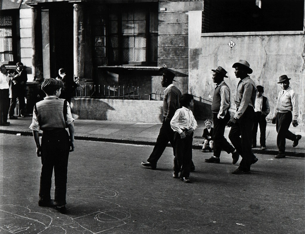
Contact Sheet of the Street Shoot:

The above shows the contact sheet of my street shoot that took place at Heston. As one can see, it shows a mix and match of good, successful pictures, along with some images that have not turned out too good, so, the unsuccessful ones.
Contact Sheet of the Metal Shoot:

The above shows the contact sheet of my metal (man-made objects) shoot. I do like the results, especially the first row, and the last two rows at the bottom of the contact sheet. There are a couple of unsuccessful ones, but that is expected, and I will not be using them for my project.
My Final and Favourite Street Shots


My Final and Favourite Metal Shots


My Final and Favorite Overlapped Images:


Image no. 1 shows an overlapping of the phone booth’s keypads, and the Heston Church. I do like this picture a lot because it looks very surreal. It looks like a metal hopscotch, instead of a chalk-drawn one. The photo shows an overcast, but serene day. The keypad looks like an imprint of an alien ship that might have landed the night before, but people are still oblivious to it. Image no. 2 shows a cycle chain and the street view behind, with a man trying to cross the road, and a car trying to pull into the road. As if a giant cycle-like object has landed in the middle of the street, and the whole street has frozen. The impact an alien ship will probably have. I like the street chaos here. Very interesting for me to think of such a scenario. One can have lots of different thoughts when seeing a photo like this. Image no. 3 shows the “Hounslow Seventh Day” building in Heston, and the bicycle chain in close up being overlapped with the building. I immensely like this image because of the abstractness, and the patterns that one can see on the chain and derailleur. It looks like a metal heart with metal veins and arteries coming in and out of it. The whole piece of architecture looks like an organ. Image no. 4 shows a quiet part of Heston through a cycle wheel. The chain and spokes are black, adding an eeriness to the scene. The street view is rather grim with only one or two cars showing life. The black chains look like they are there to ban anyone from going beyond that zone, maybe indicating danger. I like the mystery element in the image. Image no. 5 shows Heston Park. As one can see, a couple of police officers are questioning people. There might have been an incident. I like the way that I have taken this photo from a distance adding to the intrigue. I have also overlapped a metal architecture scene on top of the Heston Park scene. The day was already quite dull, and then, the silver of the architecture made the day look even more colourless and dreary.
In all my above images, I am trying to show how the inorganic chaos and clutter created by mankind is destroying the landscape of the earth, and affecting our minds without us even realizing, until we look at them objectively.
After-Shoot Evaluation:
My shoot went as planned. I went down to Heston, an area in West London, and did my street shoot there, and also captured in my camera some objects, vehicles and metal architecture. But, the rest of the metal photography was done indoors and around my house. I notice that the streets in this part of London were not so busy, and even the park had very few people playing. There were only a few essential shops like grocery stores, newsagents, launderette, Fish & Chips, library and community hall. There was more sky in the view, and the streets had a very personal feeling. I feel I have been able to express that in my images. I did this shoot on March 19, 2017. In my opinion, I do think that I have achieved this shoot and it has met my fulfillment. There were a couple of things that went wrong after I did the overlapping effect, and these were things such as not having the right two images to overlap on top of one another. Some of the images may have not come out the way in which I had wanted them to, and, some of my photos did have a very big difference in contrast, e.g. too bright and too dull, which may have hindered the evenness of the image. Otherwise, I am pleased with the outcome.
Shoot 2: Oxford Street and Soho, London
Digital SLR
ACTION PLAN:
Who/ What? I will be photographing street scenes with the chaos of people in and around Oxford Street and Soho. I shall be photographing my street scenes near the “Photographer’s Gallery” in Soho which is on Ramillies Street and want to go even deeper in that area as well as when I am in Oxford Street. I also plan to photograph man-made objects (metal) in these areas and will do so at home too.
Where? Oxford Street and Soho, London, and at home.
When? Easter holidays. 11/04/17.
Why? This is because I have chosen metal and street as two themes for my FMP, and would also like to go deeper into the city to capture the city’s busiest places.
How? I plan to use a Digital SLR camera when outside, and will be using a tripod for the indoor metal man-made objects.
My Street Shoot at Soho and Oxford Street:
Mood Board of the Street Shoot:


Mood Board of the Metal Shoot:


The above shows two mood boards of my Oxford Street and Soho shoot. There are a lot of successful images from both my street and metal shoots. One or two unsuccessful. But that is expected. In my opinion, most photos have come out well.
My Final and Favorite Street Shots:


My Final and Favorite Metal Shots:


My Final and Favorite Overlapped Images:


Image no. 1 we see the two girls behind the a rustic iron object. I have framed the girls inside the dial of the object to make the image look interesting. Almost looks like a film still. I have blended the two images to such an extent that one cannot really see the metal showing through. I really like the final result of this photo because of how I have added the blue to give that very retro look, and it looks as if I have used Cyan to create the print. The circle is representing focal point of the images, that is the two girls. Image no. 2 shows the image of the man walking against “The Photographers’ Gallery” with the image of the old fashioned phone overlapped on top of it. I really like the way in which I have done this. It almost seems as if the phone’s ring was following the man wherever he was walking. I have made the appearance of the phone look very “ghostly” and I like this effect because it makes the image look very interesting and the shades of blue that are visible on both sides of the photo give a hauntingly cold effect. Image no. 3 shows the street scene with the newspaper along with an image of a bus which I have overlapped onto the street. A huge metal structure, the bus, seems to be driving into the scene, and all remain oblivious – exactly what life has become. We all remain oblivious to things around us. Image no. 4 shows three overlapped images made into one. It has “The Organic Pharmacy” street scene and the photograph of the man on the phone near the bus stop, along with an image of a mobile phone’s apps overlapped on top of both. I like this image because I am trying to show how everyone has a major phone addiction and how one cannot do without it in this day and age. The technology is overwhelming all street users lives and I have made the use of phones stand out by showing an image of a touch phone. Image no. 5 shows a business man, again using his phone, standing against a door. I have overlapped the cycle wheel’s image on top of it. I like the way that I have done this because it looks as if I am taking an image behind the wheel, peeping at the man. I like the way that I have done the contrast of the wheel, making it darker and more visible. The man is the only person and is the main subject. Image no. 6 shows a man with two coffees in his hand walking against “The Photographers’ Gallery”. As one can tell, I have made him as the main subject and there are just two girls behind him. I like how I have overlapped the silver door handle on the Gallery building and have made most of the image a coffee colour type of contrast. It looks very interesting and retro.
After-Shoot Evaluation:
The above shoot did go quite well. I went down to Oxford Street and Soho and visited “The Photographer’s Gallery” while I was at Soho. I did capture some very interesting street scenes and people. I photographed some still-life while I was there and then photographed some at home too. I noticed the difference in the streets and buildings here compared to my earlier shoot in a totally different part of London. There was definitely more variety in people, their nationalities, shops, activities, etc. The streets were vibrant. I went out to shoot on the 11th of April, 2017. I do think that this shoot was a good one. I say this because I am very impressed with the non overlapped street and metal images, as well as the overlapped images. The tone, the contrast, and most importantly, the overlapped images came out very creative. I do think that I had chosen the right pictures to put together, and the end result came out quite interestingly and went well as pairs.
The whole idea in the images above is to show that no matter where we are, in a busy city, or in a quiet countryside. we remain oblivious to the overpowering man-made structures, explosion of new technology and inorganic surroundings. The change is so gradual that it usually takes decades to look back and see the change.
Stage 1- How I did my overlapping technique on my favourite image:


The above shows print screens of my overlapping Photoshop techniques. I had first opened my street scene image and metal image together on Adobe. After doing that, I combined the two images by selecting the tool to move the image. After the phone image was overlapped onto the street image, I went onto lLayer > Layer style > Blending options. Opacity down to roughly 53%. Select Move tool, I shifted the phone image, and placed it around the man’s head. Then, I went to Edit > Free transform. This helped me decrease the size of the phone’s image so that it would fit perfectly around the man’s head. I then went onto the Paint brush tool > Size- 1557. The Colour picker > colour to dark blue. I then started dabbing the paint on the image on the left and right. I also chose the Eraser tool at size 380 and erased the bits I did not want. I then continued to do so, erasing the centre of the phone dial to make the man’s face clearly visible. Lastly, I selected Layer > Flatten image. This then merged the two layers together. Image overlapping complete. I finally saved the file.
 Artist Research: Vivian Maier
Vivian Maier was born on February 1st, 1926, and was an American Street Photographer. She captured more then 150,000 photographs of the people, street and urban architecture of three famously known cities: New York, Chicago and Los Angeles.
She also went around the world to explore various city cultures and convey them in her pictures. Countries such as India, China, Egypt, Italy, Syria, Thailand and the Philippines were the places that she visited and captured many unique and engaging scenes which she then incorporated into her photographs.
Maier’s street photos were known to have more detail then any other street photographer’s work because of her use of medium-format Rolleiflex that gave the images more detail and depth.
Her themes varied from the successful men and women to the local children, which then led to the black maids and the run down regions of Chicago. Most of her images were indeed very documented and she did lots of themes like this.
After not being able to recover fully from an accident which resulted in her head injury, she passed away on April 21, 2009 aged 83 in Illinois, Chicago.
Does her work inspire me, and does it relate to mine?
I am very inspired by her work, and try and relate my images to hers. She captures a lot of street scenes with people doing all sorts of funny, silly and mysterious things. She captures all sorts of characteristics in people, and photographs the typical American life during the 50s and 60s which would include the well off business men and women to the average and lower class civilians. I like to photographs all these types of scenes in a busy Central London district, showing all sorts of people of different ethnicity, wealth, clothes and the slightly disadvantaged, e.g. the homeless.


The above four images were taken by Vivian Maier during the 1950s and 60s America. Image no. 1 shows a man, a dog and a girl. This is an unusually interesting picture. It is unusual because one cannot tell if the man and the girl are related. It does not however appear that they know each other. I say this because the man is shown bending down, almost as one would if they are seeing a child approaching them for the first time. The girl looks like she had something to show the man and the dog is sniffing at the girl’s shoe. Again, dogs do not sniff people they already know. The man is seen smoking a cigarette, and is maybe at the process of taking his lighter out when the girl came to him. I like this type of photography and have started to show them in my photos. I like to capture the spur-of-the-moment scenes. Image no. 2 shows a man holding a boy’s shoe to his knee. It looks like they are father and son, where the father is looking at the son’s shoe, perhaps because something is stuck underneath, or maybe the shoe is hurting his foot. The boy looks shy, maybe because of being photographed. Image no. 3 shows two girls eating ice creams. They do appear very happy and look like they were enjoying their tasty treats. One would wonder how life would have been for two girls of an African American descent to be living at that time in a country full of corruption and racism. But eating an ice-cream is all it takes for children to be happy. They are oblivious to the bigger problem of the American society. Image no. 4 shows three men near a car. One is talking to the driver. The other look drifted, with one man gazing at the camera in a rather sly way, and the third man to the right looking somewhere else. They look like gangsters, with one guy blowing a cigar. This was the time in America where mafia flourished. I have captured a similar scene like that, but it involves one man talking to the car driver, only the man in my picture does not look like a gangster.
 Artist Research: Roger Mayne
Roger Mayne, born on 5th May 1929, was an English photographer who was best known for his work on Southam Street, London.
His photography was all about the impoverished to the average class citizens that belonged to that part of the city. He focused on smokers, homelessness, rough children ranging from all ages, families and workers. There were various themes in his Southam Street work. This lasted for 5 years from 1956-1961.
After his work in Southam, he went onto colour photography. This took place in Greece and in Spain. He photographed various artists and their work as well as their studios. He did various landscape shots too and all of this got published in the mid to the late 1960s in different magazines.
He did go around to a lot of places to photograph interesting street scenes, e.g. two French girls walking in Paris. That photo shows something completely different to his Southam Street shoots as he is capturing the wealth and fashion that those two girls had to present whereas the London shoots presented something rather grim and gloomy but with a very hidden beauty in it.
He passed away on 7th June 2014, aged 85.
Does his work inspire me, and does is relate to mine?
I am definitely inspired by Mayne’s work. Some of my images do relate to his work. I also like to do his type of photography where there are interesting people and places to capture, ranging from a variety of classes and towns. I am intrigued by the reality of his work and how one does not really expect to see places so remote and desolate in one’s own country.


The above show four photographs taken by Roger Mayne. Image no. 1 shows three boys. Two of them white, and the third one, black. The boy in the middle looks as though he was in the process of saying something, and the black boy is staring straight into the camera, but seems lost. Given the situation of black people at the time, this little boy seems happy to be accepted. But is also aware of being photographed. There is also innocence being portrayed as children of all colours play together. Image no. 2 shows four women. They seem very distracted. If one looks carefully, there is police behind them. Maybe there had been a crime scene and those ladies knew the person or people! There could have been a robbery! One does wonder! Image no. 3 shows a group of men on a street. That does look like a very confusing set-up because one cannot tell what was exactly going on at that time. Was this also a crime scene – as one man seems to be writing notes, probably investigating. Maybe they were detectives. Or was this some sort of political raid in which the whole town gets together to demonstrate or vote for elections? Any one of these could be true. Image no. 4 shows a group of young boys and men shouting insanely. This image is also interesting because one cannot tell what it was that they were going mad at. Because of them being males, they could have been watching a football match taking place, so cheering for their team. Mayne had not only captured the dramatic scene, but he had also captured the sexism at the time. Looking at that photo, one cannot see any females present. This shows that women usually had more domestic roles – which would indicate a very unequal society. This photograph intrigues me and does link to my street chaos theme.
Artist Research: Angela Fouquette
Angela Fouquette was born in Maine, USA and she is a photographer who photographs many different themes, e.g. landscape, cities and mechanical work.
She spends majority of her time in New England, as she had said: “I strive to capture what New England has to offer and what it means to me. There are many other places as well that I hope to travel to, and I look forward to sharing those adventures as they come”
When it comes to her mechanical work, she photographs engines, construction sites, abandoned garages and stations etc. She captures them in various angles and ways possible. Her work includes colour, shape, sizes and the abstractness. There is a lot of detail in her mechanical work which fascinates me.
She has also photographed many parts of Europe: Marseilles in France, the green regions of Kiel, in Germany.
Her work is still ongoing.
Does her work relate to mine, and does it inspire me?
Her work does inspire me a lot, especially her mechanical work. The reason I like her mechanical work the most, is because one of my themes for my FMP is of man-made (metal) objects. I like how she captures the abstract details, designs, patterns and metal architecture, as well as the angle positioning of all her mechanical work. I enjoy looking at her pictures.


")

Image no. 1 shows an image representing mechanism. I like this image a lot because of the wave of the pattern of the fan. There is a lot of light bouncing off the metal surface and the reflective object in the middle stands out and really makes this picture appealing. Looking at this photo, which is probably of a jet engine, makes one think of speed and excitement. Image no. 2 shows a construction site. I like the contrast and composition of the photo. Looking at the image, it does look like a building that was just beginning to form, and maybe the workers had not yet arrived at the time the photo was taken. Image no. 3 shows some kind of machinery in a building. This image shows something terrifying. I say this because there is a dark deep pit at the centre. What could be down there? There seems to be a ladder going down which one can use to get to that place. It is a mystery? This is an intriguing image. Image no. 4 shows some sort of powerful machine or tool. Is is part of an engine? Is it a drilling tool? Is it part of a building site? Who knows? I do think that it relates to one of my themes of abstract metal.
 Artist Research: Micheal Orton
Micheal Orton (birth date and age unknown) is a photographer best known for the “Orton Effect” works.
Orton’s work is very interesting and indeed, colourful. The “Orton Effect” is one of his most famous works, also known as “Orton Imagery”.
The way that he created this art was by imitating watercolour paintings by deliberately making the images out of focus to give it that slightly blurry effect and by then putting together two to three transparencies of the same composition together. One slide contained the detail component, in focus and overexposed, the second and /or the third slide was the color component, and was out of focus and overexposed.
Then, he used a tripod with a camera with lens of 70 – 210mm or 28 – 70mm zoom at F4 or F 5.6. This then created an image with shallow depth of field to make the first exposure. Next, with the eye to the viewfinder, he slowly bought the image into focus. When he did this, the image was getting smaller as it was slowly coming out of focus. So, he sharpened the focus. Finally, he zoomed to compensate for this, and, that image was created.
Some of his other works like the ICM (International Camera Motion) is also very interesting, and has always been a big part of his photography . It involves using a digital camera, compound camera motion and changing focal length and focus to paint his version of the landscape. Images in his work vary from abstract to defined, combining colors, as the camera moves which is how that effect is created.
His work continues.
Does his work relate to mine, and does it inspire me?
I am partly inspired. This is because it is only his overlapping effect which he used and uses various times when doing photography which I like, but, other then that, his work is not similar to that of mine. His work is based mostly on trees, water and on the whole, nature, which is something which I am not doing for my FMP. Another reason why I may get influenced by him is because I also like how he uses “abstract” to show his work, it is similar to mine because of my use of “abstract” in metal and street overlapping. I do get inspired by his blending modes as well.
Below shows his stages of the techniques done of Adobe Photoshop for one of his images that he used. I like how he has used some of the ‘duplicating’ and ‘blending modes’ for his image, which is similar to that of mine because of the ‘blending mode’ used.


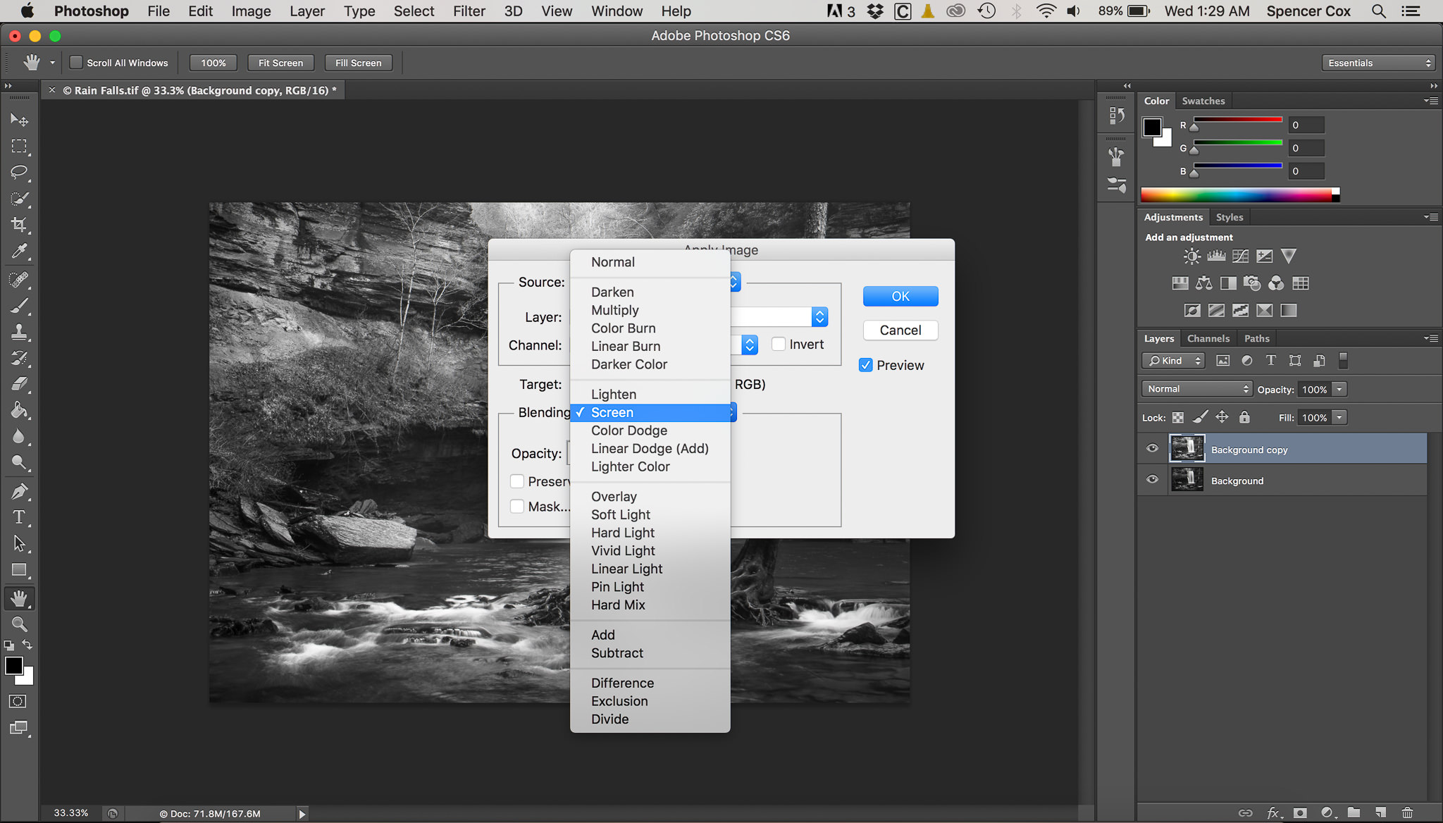
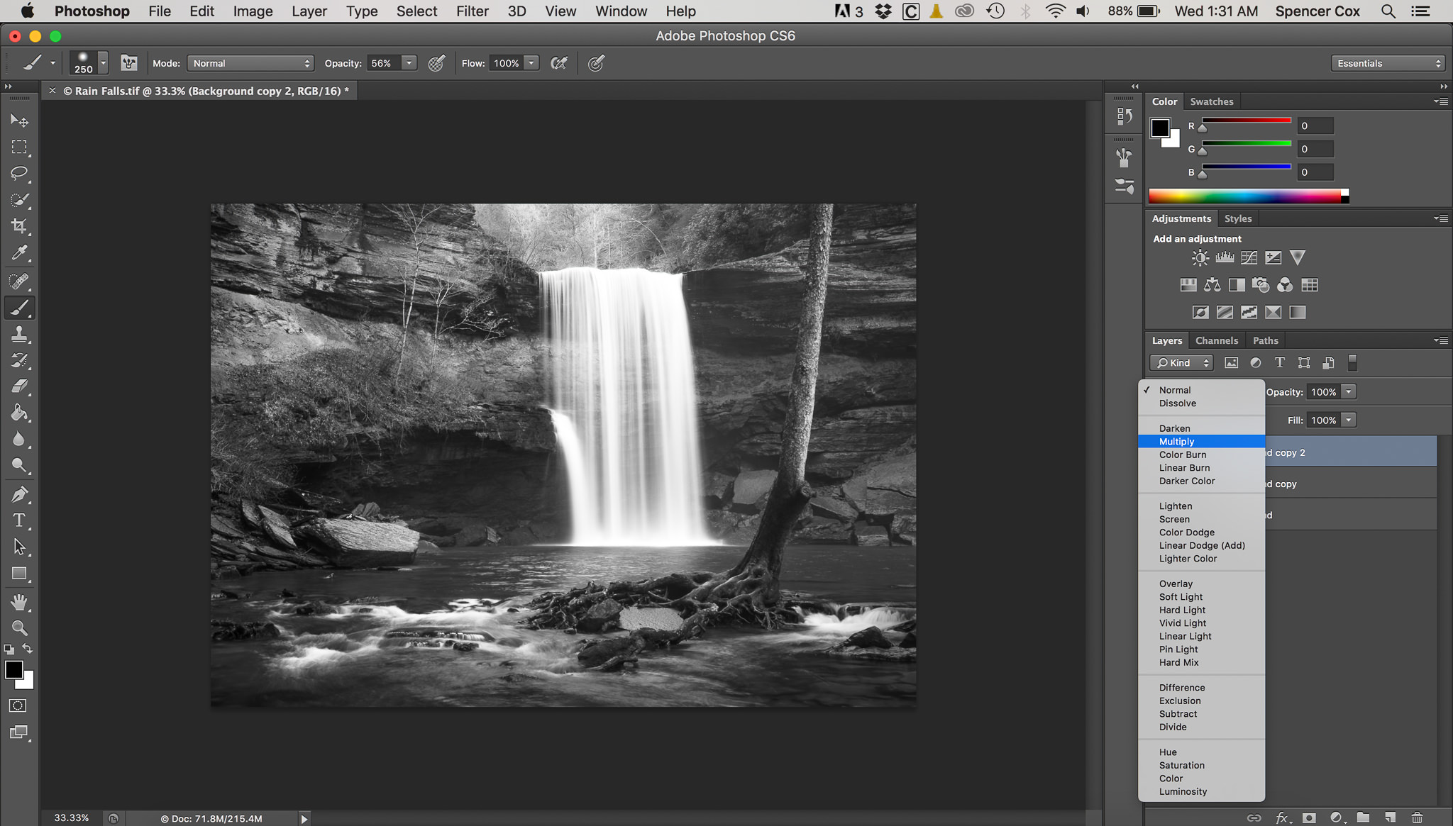
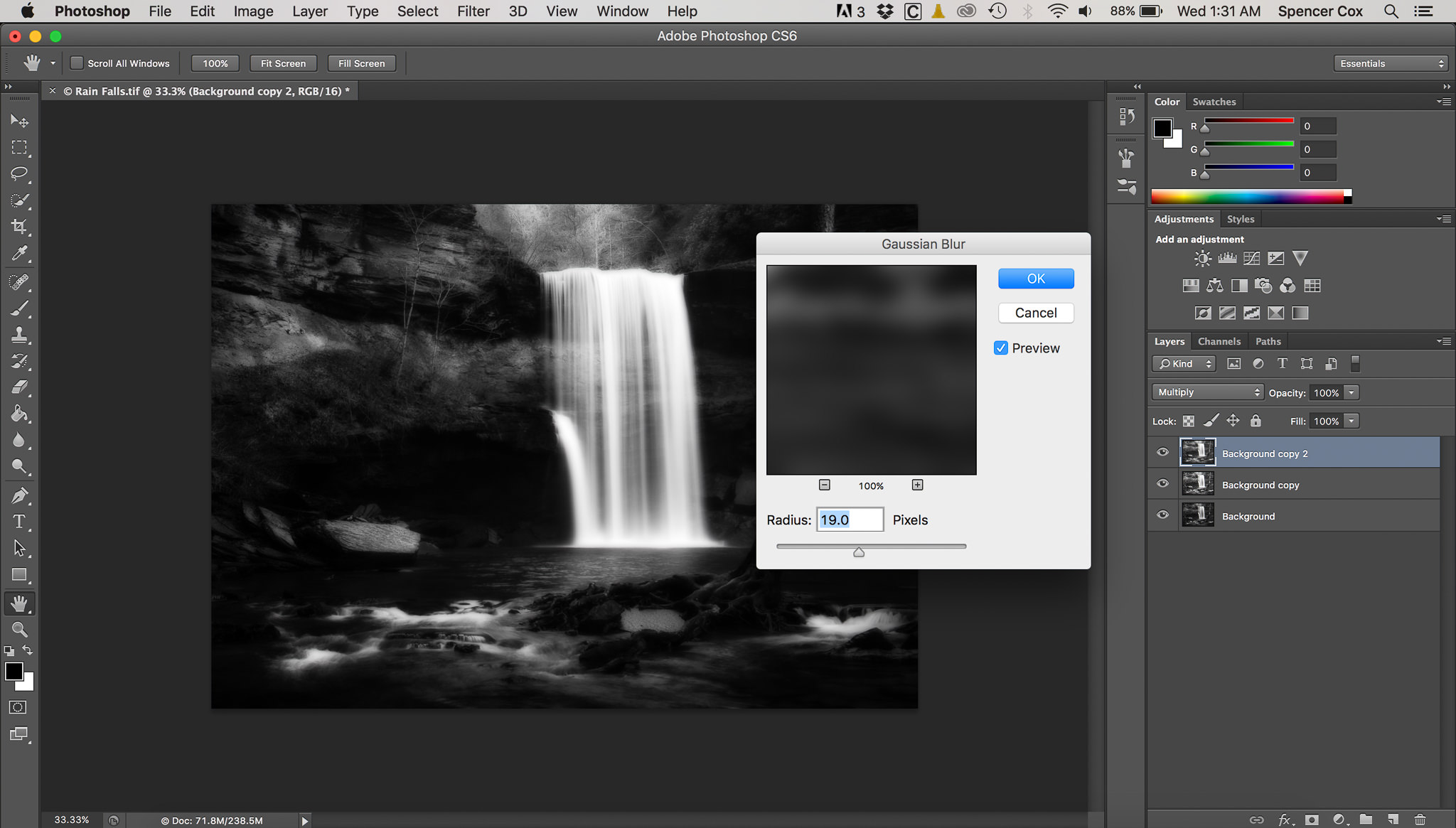
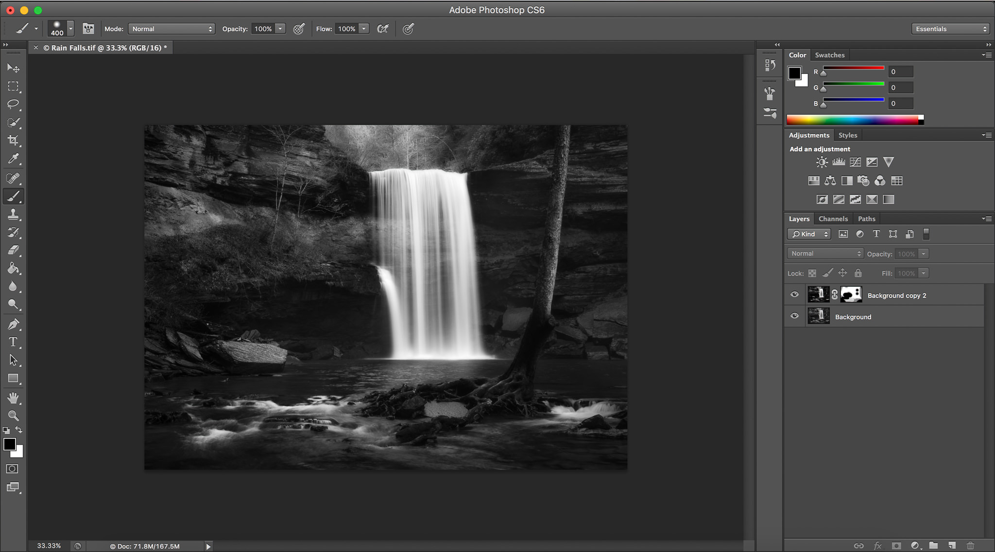
- Open image in Photoshop and duplicate the layer.
- For the top layer, click Image > Apply Image.
- In the “Apply Image” blending mode, click “Screen” and hit enter.
- Duplicate that layer, then click the “Multiply” blending mode.
- Go to Filter > Blur > Gaussian Blur. Adjust to taste.
- Merge the two top layers (Command+e or Control+e) and create a mask to decrease or increase the Orton Effect in different portions of the image. One would need to reduce the layer’s opacity, or the effect will be far too strong.
- As a final touch, since the Orton Effect darkens the shadows of a photo, one may want to lighten them back in Lightroom or Photoshop.
 Artist Research: Raymond Depardon
Raymond Depardon, (born 6th July 1942) is a French photographer, photojournalist and documentary filmmaker.
A self-taught photographer, began to photograph at the age of just 12.
Depardon went to many conflict zones to capture scenes. Countries included Algeria, Chad, Vietnam and Biafra.
In the 1980s, he had gone to Glasgow, Scotland, to photograph the slums of the city. This was a very intense but at the same time, a very beautiful body of work that he had created. It showed the poverty, the homelessness, isolation, workers, drunkards, and the general society of an extremely let down region of the city. His work was quite interesting to see.
In the 1990s, Depardon went back to his parents’ farm to photograph rural landscapes in color, and then in 1996 published a black-and-white road journal, in Africa.
Does his work relate to mine, and does it inspire me?
I am immensely inspired by him and I do think that his work relates to mine. He does a lot of street shots, and his Glasgow work motivated me the most. Deprivation was quite a major theme in that work of his, and I have somewhat showed it in some of my previous shoots too. I also like his confidence. His photos show a lot of people almost walking into the camera which is something that I have taken on greatly.


The above shows four images from Depardon’s photography of the slums in Glasgow. Image no. 1 shows two girls gazing at something which had caught their attention. I like this picture a lot because of the angle of the photo and how they appear very interested at what they were looking at. Was it a fight scene? Maybe those two girls were looking at someone they knew etc. I also like the colours of the photo, they do go well together and make the image stand out in terms of its vibrancy. This photo is also something which I incorporate into my work as I like to capture such scenes as well. Image no. 2 shows three men standing against a wall, laughing. The man to the left hand side of the wall appears to be hysterical, making the passer-by slightly uncomfortable.It looks like they had a lot to drink and could not control their emotions. I like this photo because of how Depardon captured their funny moments almost instantly, and it does seem as if they were not aware that he was photographing them. Image no. 3 shows a lady walking with her baby in a pram. As one can see, she was walking in a very desolate area. It appears as if the buildings behind her were government housings. This picture shows a very lonely place, and one would wonder what a lone woman with her baby was doing there? Image no. 4 shows three homeless people sitting against a wall with rubbish beside them and a fire lit. It looks like a very grim place, and impoverished. There was nobody present but them. Everything looks abandoned, and even the shops seem empty and run down. The shop by the name of “Sadie’s Lounge” is quite a good name because is it kind of representing the homeless people and their misery, and therefore, they belong in that “lounge”, that “place”. It is a very ironic image.
 Artist Research: Royna Galka
Royna Galka (born in Germany), is a German born British photographer who moved to London in the early 1990s and started her career on a serious level ever since.
She became very passionate about street and urban photography in London and has captured many different and extraordinary scenes.
Majority of her work is on an urban scale, and she usually photographs the cityscapes while on an urban shoot. She also creates intimate images of urban life, frequently blurring between fine art and documentary. Royna’s images are often intriguing, triggering thoughts and emotions in the viewer.
Other than street and urban photography, Galka also shoots lifestyle, portraits, and commercial assignments, mainly on location.
Galka’s street scenes include a lot of smokers, business people, fashionable people, people of all nationalities, and generally, every day street scenes. Her images are quite interesting and she does come across as a very confident photographer who knows when to pick the right moment.
Does her work relate to mine, and does it inspire me?
I do get inspired by her, and her street photography work does relate to mine. I say this because she captures a lot of typical chaotic street scenes where there are a lot of interesting people and fashionable men and women. She shows humor, work, loneliness and people with all sorts of characteristics. I do enjoy doing these kind of shots.


Image no. 1 shows two gentlemen. One of them is shown to be hysterically laughing at something that the two were talking about. I like this image because the characters in this image are shown to be very natural, and the way that this photo was taken was also quick and sharp. The two seem to be so involved with whatever it was that they were doing, that it seems as if they did not notice Royna photograph them. I like the slight blurred effect in the background, as it focuses on the men. Image no. 2 shows a group of gentlemen wearing suits and hats. One of them seems rather uncomfortable, while the rest are happily laughing and talking amongst themselves. What makes this photo so interesting is the mystery. Why were those men dressed like that. Was there a parade? One does wonder? It is a very interesting image, and does relate to that of my street theme. Image no. 3 shows one man, and two women walking. They all seem under pressure and one can tell that they were walking at a quick pace. I like how their steps are juxtaposed. They all seem to be in a rush, probably, to go to work. This is a classic example of people stuck in a rat race. Image no. 4 shows a smart looking gentleman walking across the road. He comes across as confident and one can tell that he has not noticed Royna photograph him. I like the image. He is the main subject in the photo and has a lot of character about him. This photo is something which I have incorporated into my imagery, and so yes, it does inspire me.
Artist Research: James Bartholomew
James Bartholomew (born, New York, 1960) is an American photographer.
Bartholomew travelled to and fro from London to East Coast Coast of America several times during his formative years. It helped with good understanding of the western world that that a major influence on his photography.
In 1984, when Bartholomew was in London, he began to work for the London Agency as a Photographic Consultant. While doing this, he came across Kew Gardens. He liked everything about it almost instantly. From 1990 -1998, he published three books, “The Magic of Kew”, “The City of London”, and “Inside the Tower”.
His work varies. He photographs nature, architecture, cities, weddings and people. His city and architecture work is quite interesting to view. When it comes to his city work, he shows the typical city life of London, e.g. buildings, historic sites and famous statues.
He did do a lot of documentary style work too, e.g. his “Travel” work consists of photos taken abroad, e.g. in India. He also documented the slums of other countries, and, went around England to experience and to capture the historic sites in-depth, e.g. Stonehenge.
His work continues.


The above shows photos taken by James Bartholomew. Image no. 1 shows a very a very modern building. I like this picture because it is similar to a photograph that I had taken of a modern building with reflective glass. I like the photo’s angle and the way that the image has been taken. So, I really admire the vast amount of shapes that can be seen on the building and the reflection of the sky and sun. Image no. 2 shows another metal architecture. I like this image because of the colour and shapes. It looks like a ride in an amusement park, but, it might not be so. Interesting abstract patterns. Image no. 3 shows a street scene. I like how the man is the main focus, and everyone behind is blurred out. Why was that man wearing a mask? Protecting from some virus spreading? Or, was he a stage actor who stepped out of a building to answer a call? Image no. 4 shows a very derelict street scene. There are no people, it is just an empty place. This street scene looks like a commercial district.
Does his work relate to mine, and does it inspire me?
This artist does inspire me greatly. I like some of his mechanical work and some of his street shots. Although his photos consisted more of buildings, empty streets, indoor architecture etc, I still get influenced by some of the work that he has produced and is producing.
 Artist Research: Dougie Wallace
Dougie Wallace, also known as Glasweegee, is a British Street photographer, from Glasgow, who is based in East London.
Wallace was born and raised in Glasgow, and lived in Blackpool for a couple of years in the 1980s before enlisting in the army. For 15 years, he has lived in Shoreditch, east London.
In October 2010, for two and a half years, Wallace made 30 trips to Blackpool to complete his first book called “Stags, Hens & Bunnies: A Blackpool Story” (2014). This involved him photographing the stag and hen parties that visit the town. Regarding this, he had said: “lads and lasses on their worst behavior, partying away in a bawdy sea of L-plates, handcuffs, blow-up dolls and uniformed fancy dress”, “in various states of undress and drunkenness; revelling in bars, puking in the street, refueling at chip shops.”
For 15 years, Wallace was photographing Shoreditch, East London. and during his time there, he published a second book in 2014 called “Shoreditch Wild Life”.
He also went to Mumbai, India, and photographed the disappearing Premier Padminis, the taxis on Mumbai streets, and of the people driving and using them. These taxis have been operating since the time Mumbai was called ‘Bombay’. He produced his series in a book called “Road Wallah”.
He has been awarded a Second Prize in the Portraiture category of the 2015 Sony World Photography Awards after having two books of his work published.
His work continues.
Does his work relate to mine, and does it inspire me?
His work relates to mine somewhat in the sense of shooting strangers on the streets. But our techniques differ, as he shoots people right in their faces, even annoying them to a lot of extent sometimes, but I shoot strangers either after seeking their permission, or discretely after keeping my camera ready for the person to walk into the frame. His work focuses on fashion, and documentary photography when he is out on the streets. I have focused more on the general people and city life on a daily basis, so therefore, my themes are slightly different. I am more inspired by his ability and confidence to approach people and take their photos, rather then the work itself. So, it is his photography approach that I admire, even though I do not follow the same approach.


Image no. 1 shows a lady in close up. As one can see, she seems unhappy with Wallace photographing him by firing a flash in her face. Her expression suggests that her personal space has been invaded. The bright red of her jacket really stands out and makes the photograph look nice and catchy. Image no. 2 shows a woman and a man at a bus stop. They look like they are flirting, and are busy gazing at one another. I like this photo because of the composition, and lighting that is falling upon the young couple. Love the spontaneity of the shot. Image no. 3 shows a busy street scene where a group of fashionably dressed people are walking towards Wallace. They look very pleased by their photo being taken and probably because they were dressed in a certain way, and sought attention. There is a slight blur if one notices towards the blonde lady. Image no. 4 shows a lady and a girl (a little girl with her guardian, probably mother)). Woman clearly seems angry at their photo being taken. The little girl also looks quite distracted and confused. They were really taken by surprise, it seems.
Two of my Major Artist Influences:
Dougie Wallace and Vivian Maier:

Why These Artists Inspire Me Greatly?
Dougie Wallace:
This photographer inspires me a lot mainly because of the confidence that he portrays every time he is on the street, and the speed at which he captures his subjects. On the street, he tends to choose the creatively dressed, the interesting looking, and the wealthy lot. I also like the spontaneity in his work, plus the variety of his subjects. I am learning to develop my style like his, by being quick when out and about. One only gets a split second to capture a shot, and I have to remember not to waste that moment in planning.
Vivian Maier:
Maier’s approach to photography is in stark contrast to Wallace’s. She used to take photographs of all sorts of people, from the rich, to the average, to the poor. She photographed not only the businessmen and women in the cities, but also those affected by issues such as child labour, black and white segregation, homelessness, poverty and disability. I get inspired by her because of her themes. They are varied, and are the types of themes which I like to explore and document. I like to show the differences in people, and the movement of city life, like she did. I like her subtle approach while taking people’s photographs, as this shows that she had immense respect for all her subjects, regardless of their class or status in society.
Research Sources
Books
Bartholomew, J. (1989). The City of London: a photographer’s portrait. London: The Herbert Press Ltd.
Depardon, R. (2016) Glasgow, 2nd edn, Paris: Editions du Seuil.
Journals
Symth, D. (2016) ‘East End Archive’, British Journal of Photography, November (7853), pp. 42-49.
Websites
Roger Mayne (2017) [Exhibition]. The Photographers’ Gallery, London. 3 March 2017- 11 June 2017.
Fouquette, A. (2017) Angela Fouquette Photography, Available at: http://www.fouquettephotography.com/ (Accessed: 7th March 2017).
Galka, R. (2015) Ronya Galka Photography, Available at: https://www.ronyagalka.com/ (Accessed: 7th March 2017).
Orton, M. (2017) Michael Orton Photography, Available at: https://photographylife.com/ (Accessed 14 March 2017).
Maier. V. (2016) Vivian Maier Photography, Available at: http://www.vivianmaier.com/about-vivian-maier/ (Accessed 14 March 2017).
The Photographer’s Gallery – Roger Mayne Exhibition Essay
West Indians, 1958
The above photo was taken in 1958 in Southam, London by Roger Mayne, and is titled “West Indians”. This picture immediately caught my attention. The people look so interesting, like the cowboys in America. Their outfits not what one would see in London of 1950s. This is apparent in the way the onlookers are busy scrutinising the new residents. England was a very different society in those days. Very few immigrants were found here, and so locals were not accustomed to seeing coloured people. Of course, there was racism, and intolerance. This being a poor part of the city, people are even more intrigued, and only the rich and famous travelled around the world and were exposed to all kinds of cultures and communities. The poor had never stepped out, and neither had they acquired television to see things outside their localities. The West Indians are being looked at in a curious way, and as a novelty. There is excitement in seeing foreign faces. This raises a lot of questions, and this is why it interests me greatly.
When it comes to the relationship between Mayne and the characters, it does not look as though he knew the people. Though this might be the case, he seems friendly and familiar enough for people to not pay attention to his presence. They are busy in their own thing. He managed to capture a great moment of that time London.
Shot during the daytime, with no artificial lighting. The image background make up roughly 75% of the picture’s frame whilst the images’ subjects makes up around about 25% of the image’s frame. There is large percentage of background that Mayne has included which adds to the interest.

Southam Street Group, North Kensington, London 1956
The above shows a photograph again by Roger Mayne taken in North Kensington, London, in 1956. A small group of children of wide age range. I like this picture because the children look natural, not posed, and appear to belong there. They seem completely disengaged with the photographer and minding their own business, except for one girl who has noticed the camera. Other children seem oblivious, or indifferent. Their innocence is also conveyed through their body language. There is also a little baby hanging out of the arms of a young lady. One can tell many things from this photograph. The culture of not having compulsory schooling until the age of 16. Larger families, with older siblings looking after younger ones. The older ones in the group are fixing the bicycle, to maybe give the baby a ride.The location looks impoverished. It does not look like a place that has been maintained well. It could be possible that all those children live in that one house, or they could be from the same street. I admire the photographer’s courage to photograph a scene like this and it does look a still from a very old film.
When it comes to relationship between the photographer and the subjects. No, it does not seem as if he knew the children and adults. If that was the case, they would have acknowledged Mayne being there, like smiling or pointing at the camera. l Some of them are completely oblivious to him being there.
Shot during the daytime, with no artificial lighting. When it comes to percentage of subjects and backgrounds, roughly 65% of the image make up the people, with the background being roughly 35% of the photo’s frame.

Man leaving steel works, Sheffield, 1961
The above shows a man leaving steel works in Sheffield. This picture was taken ins 1961. I like this photograph because of how the image has been composed, the angle and the location of the photo. What makes it so interesting is to see a long road with only three people, in three different spots. Again, showing the aspect of England that is no longer found these days. People had factory jobs, early start and late finish. One can imagine what goes on in these people’s minds. Family worries, perhaps. The buildings that surround them look very daunting and dull. Street has no trees. It looks desolate. Very industrial setting, with stressful jobs. Those buildings are probably used for the steel works.
Speaking of the relationship between the photographer and the people in the photo, it does not look as though the people know Mayne. But maybe they have seen him around, so they don’t mind his presence.
When it comes to percentage of subjects and the background of this image. The people make about only 3% of the photo’s frame, while the background is 97%, but yet, the 3% is the main focus.

Nottingham St. Ann’s slum, 1969
The above shows a family outside their house. I like this photo because of how they all look very content and happy with their photograph being taken. The lady sitting at the doorstep was clearly trying to get her baby girl to look towards the camera and to behave herself. This photo is funny and I like how Mayne has captured the moment where the woman is in the process of preparing her baby for the camera. Mayne does not wait until they are ready. He wanted to shoot the un-prepared moment. The lady to the left seems to be a neighbour who stopped by with her son to speak to the family. Mayne probably walked past right then.
This photo’s characteristics show happiness, family, society and poverty. When it comes to the relationship between Mayne and these people, I do not think that he knew them, but might have been familiar as he hung around taking photos, and become friends with some of the locals. Cameras were not so common in those days, so anyone with a camera would be noticed instantly.
Natural daylight shot. When it comes to the percentage of subjects to framing, roughly 75% make up the image’s background, with the remaining, roughly 25% making up the image’s people.
Shoot 3: Southall – King’s Street, West London
Digital SLR
ACTION PLAN:
Who/ What? I will be capturing the colour, culture and the different minorities that one gets to see when they go to a place like that. I shall be going to King’s Street and will be taking most of my photos there. It will be a very different street compared to most of the streets that I have captured. I will also be shooting man-made (metal) objects too whilst I am there and will be photographing them at home as well.
Where? King’s Street, Southall, London, for both street and metal, and even at home to shoot any metal in and around my home.
When? 18/04/17
Why? I would like to portray a different way of life.
How? I will be using a Digital SLR Camera.
Mood Board of Street Shoot:


Mood Board of the Metal Shoot:


My Final and Favorite Street Images:


My Final and Favorite Metal Shots:


My Final and Favorite Overlapped Images:


Image no. 1 shows a huge announcement of the Sikh celebrations of Vaisakhi, a very old tradition. Net to this scene was a scene of a booth with a WiFi signal, a totally new thing, the internet. I superimposed that on the street scene to show the juxtaposition of the old with the new. A viewer’s eye may immediately fall onto the WiFi box rather then the large poster of the festival. This shows how one can never be free of these things. How these can distract one the essence of community. Image no. 2 an image of a bus with a street scene of an elderly couple overlapped on top of the bus photo. This shows the Sikh community who are settled in the area for at least three generations, and they feel completely at home, but there have been other influences too. Image no. 3 shows a street scene. It almost looks as if the piece of machine is spreading on the street causing destruction. Image no. 4 shows a place of worship behind, with an image of a cash machine overlapped on top of it. I like the way that I have done this photo. One is a natural place for prayer, and the other is a machine in which one can withdraw money. This is similar to the first overlapped image of the WiFi box in front of the festivity poster. This just shows how machinery is being used more than going to these places of worship, which again show the influx of technology on everybody’s lives.
After Shoot Evaluation
The above shoot did go well, but I did not go on the date that I was originally planning to. So instead of going on the 18th as planned, I went on the 21st. I chose Southall for one of my shoots because this is an area like no other. It is vibrant, colourful, and buzzing with activity. It has various minorities living happily together. It has temples, mosques and churches. It has shops selling colorful clothing and jewellery. The area is full of restaurants selling food from Asian and African countries. It was a predominantly Sikh area, but recently some other communities from African countries have also settled here, and they have opened their own shops too. A wonderful experience all in all. I do think that I had a chance to show a wide variety of streets, people and ethnic minorities. I am satisfied with the outcomes. One disadvantage may have been that at times it was difficult for me to find the right match when overlapping, and that sometimes led to a tough decision for me. At times, I was also unsure as to the amount of colour balance and contrast that I should use because of the over do that could have easily happened. But, other then some of these minor issues, all went well.
Stage 1- How I did my overlapping technique on my favourite image:
")
")
")
")
")
")
")
")
Shoot 4: Embankment, London
Digital SLR
ACTION PLAN:
Who/ What? This trip will be taking place because of an exhibition that my class and I will be going to see. It will be taking place at “Sony World Photography Awards” in “Somerset House”. Whilst I am there, I also plan to capture busy street scenes and the people chaos that most of Central London presents.
Where? Embankment, London.
When? 25/04/17
Why? My class and I will be visiting “Sony World Photography Awards” and will be seeing Martin Parr exhibition. After that, I plan to photograph the street and people scenes of that particular area.
How? Will be using a Digital SLR Camera.
Mood Board of the Street Shoot:


Mood Board of the Metal Shoot:


My Final and Favorite Street Images:


My Final and Favourite Metal Images:


My Final and Favorite Overlapped Images:


Image no. 1 shows a street scene behind, and, the separate bicycles image, overlapped on top of the street scene. In my opinion, I do think that it makes a very good combination, because the cycles on the road of the street and the overlapping image of bicycles show a similarity between the two photos. It almost looks as if the bicycles have been badly damaged and are littering the road. I like the effect. The black and white effect that I have added also makes the image look like a photo from 1950s London. Image no. 2 shows a scene consisting a building where there is a lot metal creating an abstract effect. This mechanical architecture was actually taken on Waterloo Bridge. It does look like a place where work was going on. I liked it for its abstract beauty and it immediately caught my attention which is why I photographed it. The two men standing was taken from a separate image. I overlapped their photo on the abstract. The combination works. They were on the road when standing there holding the sign, but it looks as though they were up on the building showing the sign. This is what makes the image interesting, one would think it is a single photo. Image no. 3 shows a lady on her phone against “The Sony World Photography Awards” building, and, the overlapped image of the London Eye on the image of the building. I really like the combination as it does appear as if the London Eye is next to the lady. I like how she seems to be floating on the sky. The London Eye looks very intimidating, like a giant machine from the skies. Image no. 4 shows a street image with an image of a couple of satellites overlapped on top of it. I am trying to show the influx of technology in that place with many old buildings. No one can tell what those objects floating are. Very intriguing. They look like balloons of a metallic colour, but in actual fact are satellites from a building. Image no. 5 shows a street scene with the architecture on the Waterloo Bridge overlapped on top if. I like this effect because it looks as if the people have been trapped by a gigantic piece of metal. Some also look like they are walking through it, or over it. I also like how the London Eye can be seen through the architecture in the sky. This is an effect that I am pleased with and I also like the colour contrast. The yellow sort of shines through below with bits of grey, blue and other colours coming through.
After- Shoot Evaluation
This above shoot did go quite well and according to plan. I went on this shoot as put down, on the 25th of April 2017. I enjoyed this shoot immensely and got a chance to see a wide range of streets, architecture, lots of workers, bridge view etc. I am also pleased with how my images have turned out. I do think that I took many risks to photograph people approaching me. I am also satisfied with the overlapped techniques. They have come out interestingly, and I am also glad that I used the black and white effect to represent two of the images. I think that I have made that effect work on those two and have kept the colour effect for the remaining three images as I think that they look better that way. The colour and tone contrast has also worked well for them, with colour standing out in some of the photos. It was very time consuming as I had to keep redoing the overlapping stages for my fulfillment. That was all. Otherwise, all the pictures are good and I like them.
Stage 1- How I did my overlapping technique on my favourite image:


Shoot 5: Paddington, Westminister, London
Digital
ACTION PLAN:
Who/ What? When in Paddington, I will be photographing the metal architecture of Paddington Station, and, the various sites, streets and people generally in that part of the city. I plan to do a photo shoot starting from Paddington Station and walking all the way to the Frontline Club.
Where? Paddington, Westminister, London.
When? 04/05/17
Why? This is because I will be going to photograph a charity event taking place at the Frontline Club in Paddington. Whilst I am in Paddington, I will be photographing the abstract metal architecture of the Paddington Tube Station to the people chaos of the streets. I plan to do a shoot from when I get off at the station to when I reach the Club, and even after the event is over, if possible. I do not plan to venture further, and only want to stay around that area.
How? I will be using a 35mm Digital SLR Camera.
Mood Board of Street Shoot:


Mood Board of Metal Shoot:


My Final and Favourite Street Images:


My Final and Favourite Metal Images:


My Final and Favourite Overlapped Images:


Image no. 1 shows a man standing on the corner of a street with metal shutters on the shops. It appears as if he watching a landing of a huge alien structure. The metal structure looks imposing. Shows how man-made structures are capable of intimidating the man himself. Image no. 2 shows a street scene where I have overlapped an image of CCTV cameras of an underground station with golden light. This photo appeals me because of how it looks as if the camera is watching from a distance and the yellow light is lighting the street. It just shows how in this day and age, one cannot really hide from CCTV cameras because they are everywhere. Image no. 3 shows a street scene along with the tube station escalators overlapped onto it. I like this image because of how it looks as if people are coming out of the building high up in the sky. The effect looks very ghostly and again, I like the juxtaposition of the old building with the modern machinery. The street scene, people on the stairs, and the building really gives the chaotic beauty of the 21st Century World. Image no. 4 shows a very modern glass building with an image of a street with people walking in one direction which I overlapped. I like this image because of how it seems as if the people are walking in the air. Some of them are dressed in business suits and so it does look like their place of work. Again, surrounded by modern buildings, tree-less landscape, and metal
After Shoot Evaluation:
I went on this trip on the 4th of May 2017. In my opinion, I do think it went really well because I got some very interesting street shots and metal architecture, and, managed to present them in a creative way. The only unsuccessful thing was that I could have maybe done some more photographs, but other then that, it went to my fulfillment. I have a lot of favourites in both street and metal. I do think that my images came out quite well and I am also happy with some of the authentically old architecture that represents the city’s ancient look. I like how I have managed to capture the city’s old and new parts along with various people. I am satisfied with the outcome. I am happy and only experienced a few difficulties when overlapping, which in the end, turned out to my expectations. I also like the non-overlapped street and metal images that I kept separate. I say this because they look very strong on their own and have very good tone and contrast as well. I do not think anything went wrong on this shoot.
Stage 1- How I did my overlapping technique on one of my images:
")
")
")
")
")
")
")
")
")
Sony World Photography Awards Martin Parr Exhibition – Essay

Martin Parr, “Gourock Lido”- Renfrewshire, Scotland.
The above shows a photograph taken by Martin Parr in Renfrewshire, Scotland in 2004, at Gourock Lido. I like this image because it shows only one man swimming in the large pool. The day is dull and cloudy. But this looks like a place where many people must visit, as there are loads of deck chairs, but for now empty. It just looks too cold for swimming. There is no glimpse of warmth – no sunshine, no crowd. The grey skies make the scene look dreary and cold. There is a very high contrast between the light blue to the greyish black. Why is it so isolated from anything? One does wonder.
When it comes to the relationship between Parr and the man in the water, they probably did not know one another. It seems as if Parr was looking around the place to only find that a man was alone in the water and that it would make a perfect shot. Finally, when it comes to the percentage of the subject which is the man to the background. Roughly 2% make up the subject, with the remaining 98% making up the background – the pool and grey scenery, but man remains the focus.

Maximilian Conrad, “The Green Monster – Germany
The above image was taken by Maximilian Conrad in Germany. This is such a dramatic scene. I love it. The heavy clouds of rain is turquoise and bits of grey. The colour contrast is very deep and almost looks like a clash of earth and the skies. It is a beautifully created image. The main focus is the sky, but also the road that seems to be entering the sky. Like the sky is engulfing the road.
The sky makes roughly 75% of the photo frame with the road and grass roughly 25%. This photo was taken in Germany, and had I not known that, I would have thought that it was a Scandinavian image because in those countries the Northern Lights are quite common and famous. What was happening exactly? Was the sky like that because of rapid changes in weather, e.g. sunny to rainy to breezy etc. One does wonder!
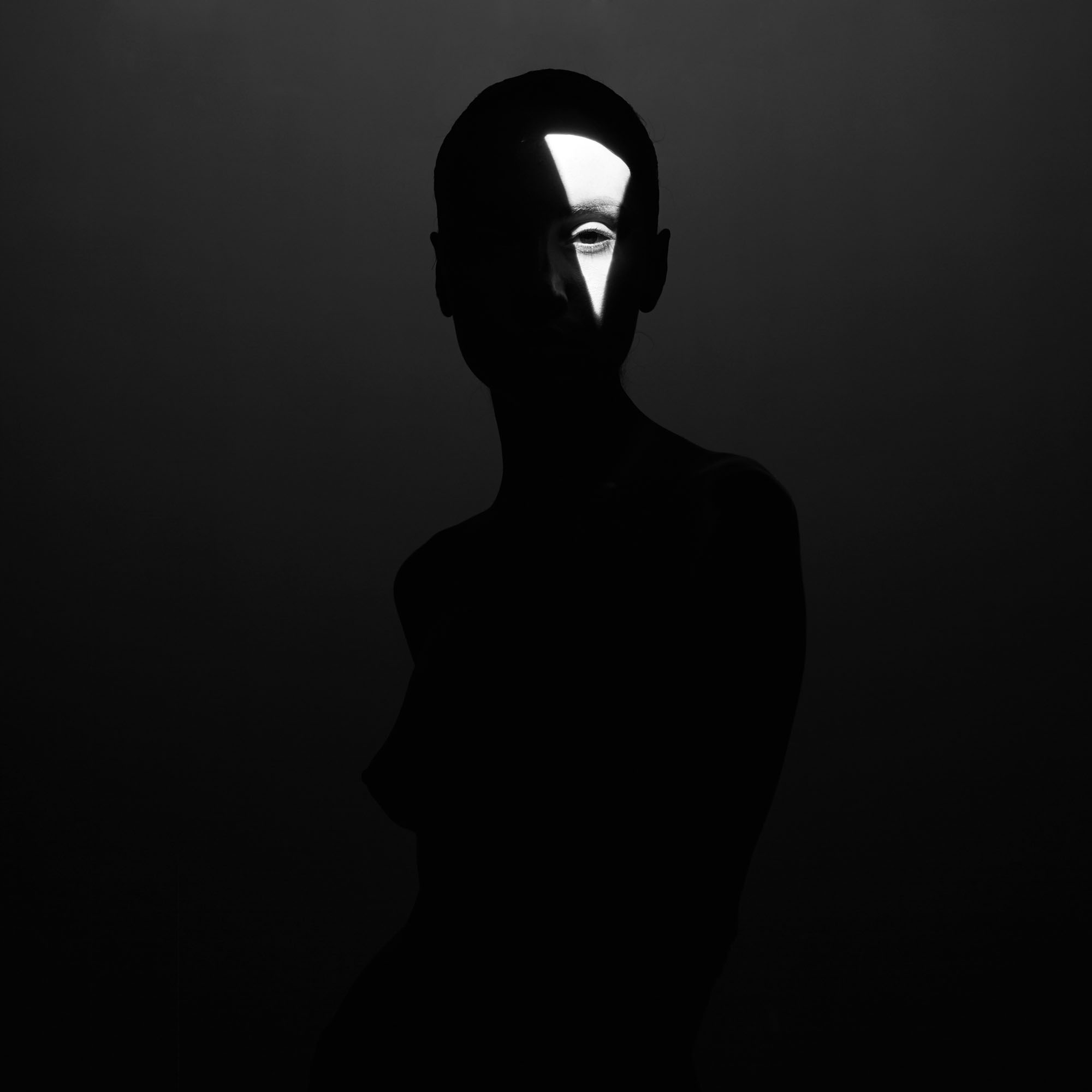
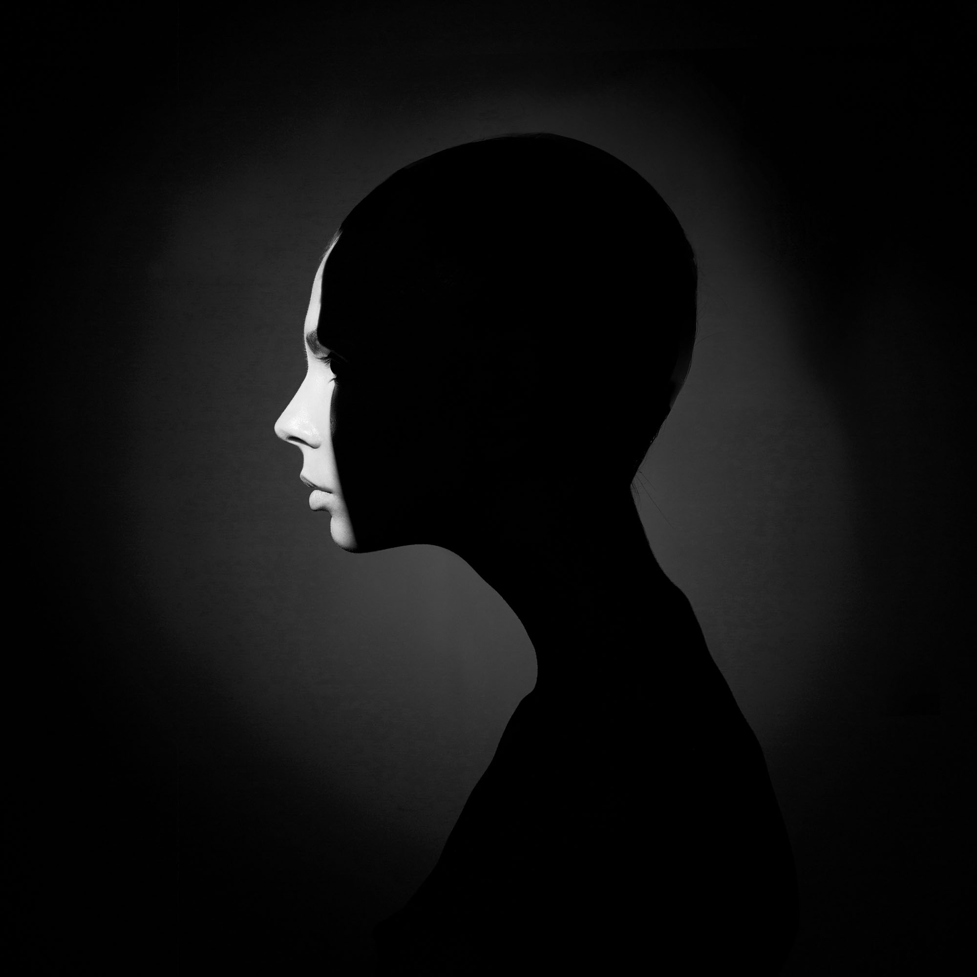
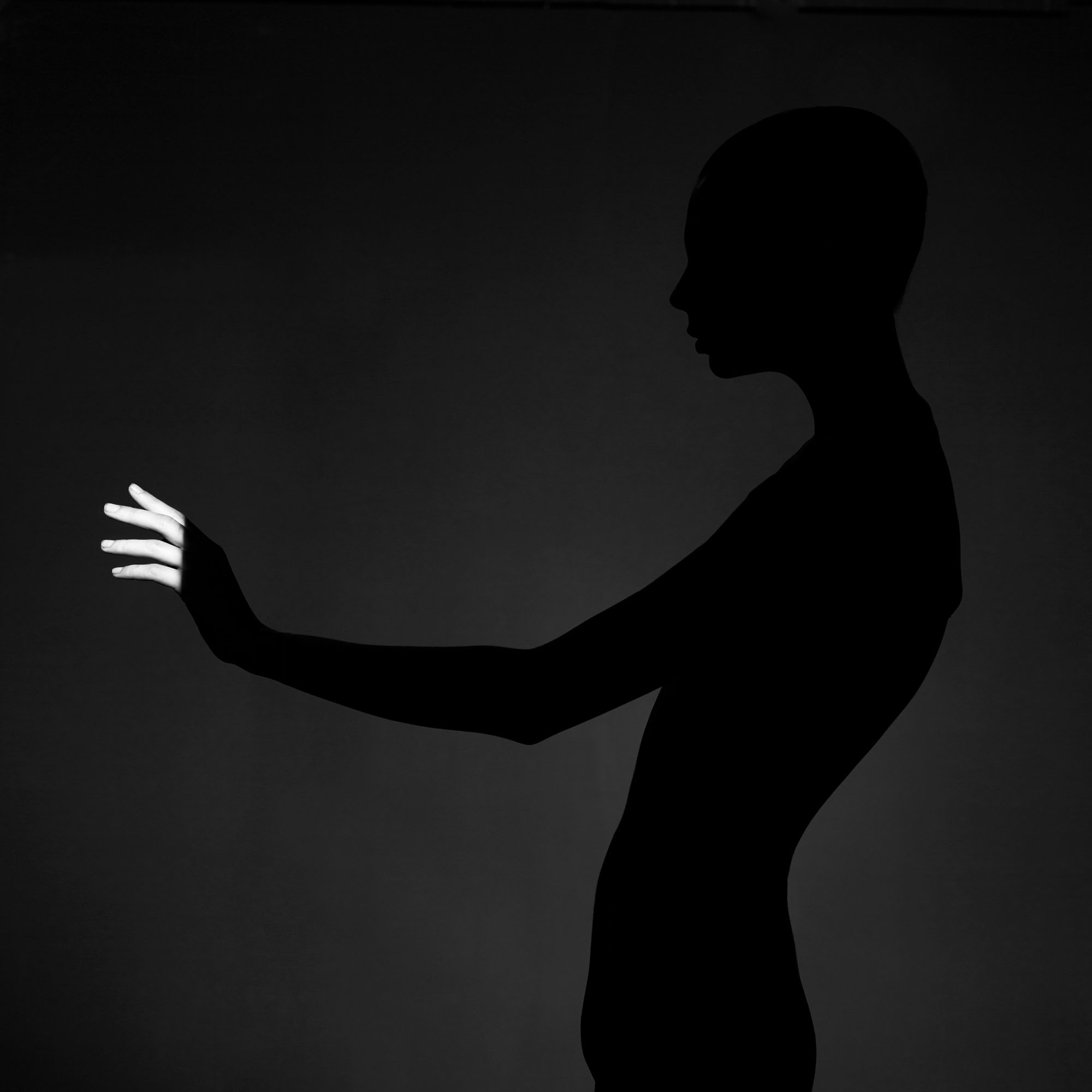
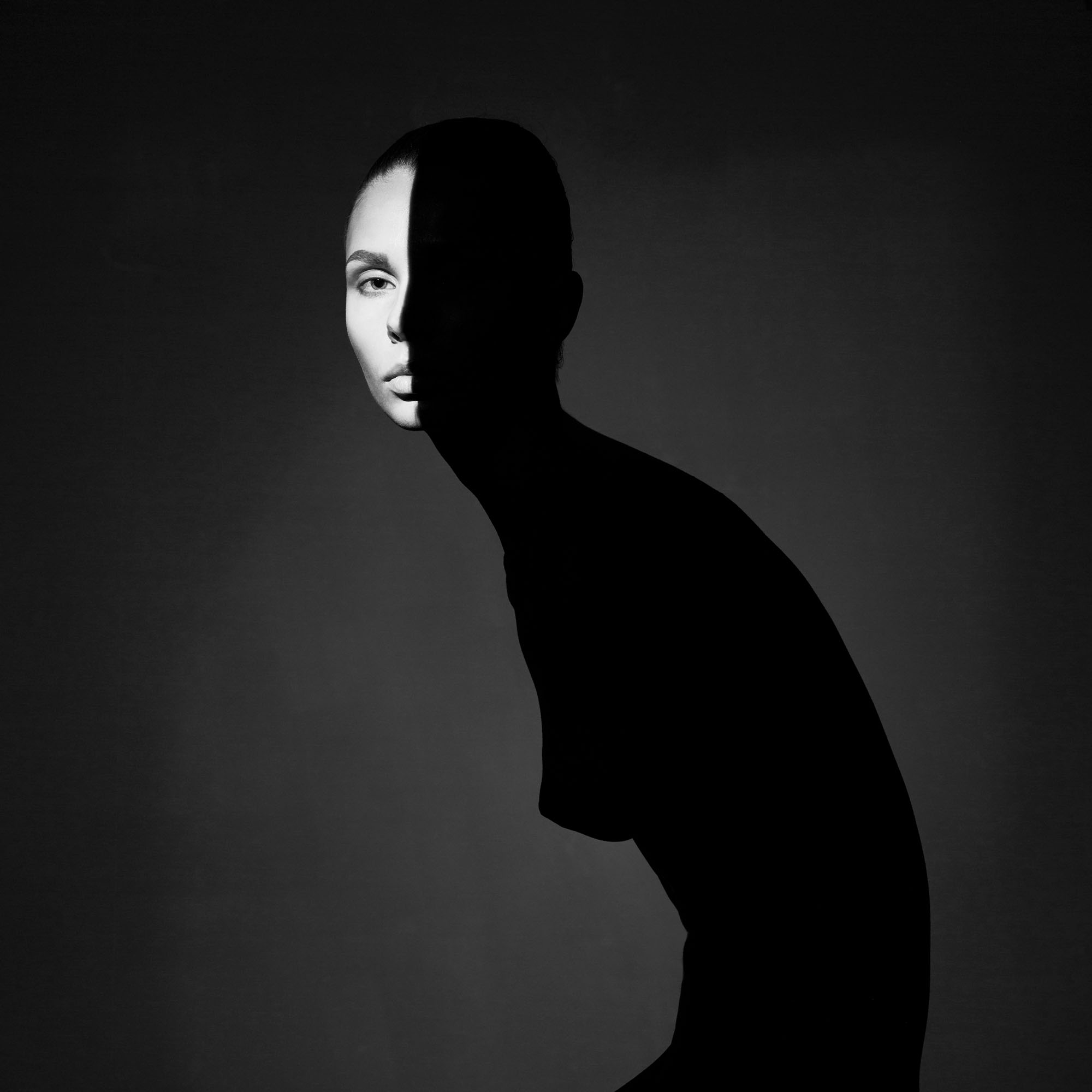
George Mayer, “Portraiture in Place” – Russia
The above shows four separate images made into one taken by George Mayer in Russia. I really like these four photos because of the hidden identity portrayed in all of them. Appears to me that there is only one lady in all four photos. There is spot lighting used int he studio to create these shots. In the first image, the lady is staring at the camera with only a quarter of her face showing. It is a hauntingly beautiful image. Haunting because of the eyes, and beautiful because of the black and bright white contrast which looks lovely. Could she be hiding something? Who knows? The second image shows the lady standing sideways. Again, a very lovely image with only a quarter of her face shown. One can tell that she is expressionless and appears very calm too. I also like the slight shade of white forming a faint circle around her. The third picture shows the lady with her arm out, and only the finger tips of her hand are lit up. This is representing something eerie again because of how it seems as if she is reaching out to something with guilt. The final image shows her half of her face. She is bending down slightly. One can see a bit of her face this time, a little less obscure. Still a nice photo.
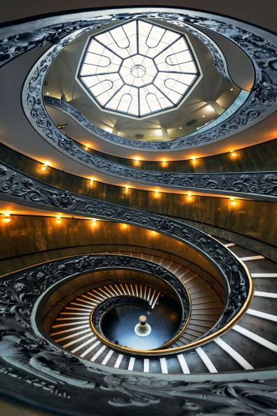
Songquan Deng, “Spiral Staircase” – China
This image was taken in China, by Songquan Deng. I like this image because of the way in which the stairs are going round in a pattern, like a sea-shell. There are lots of spirals, colours and abstractness. It does look like a typical Chinese architecture where emphasis is on spirals and other shapes, like a dragon’s body. Looks like this was taken in the hall of a large theatre. This image caught my attention almost immediately. I love the composition. The S-shape of the stairs, equally divides the photo in two halves. There is a lot to see and think in a photograph like that one. There is only one subject in the photo and it is the stairs. This makes up 100% of the photo’s frame. The contrast consists of greys, blacks, blues, whites and yellows. Overall beautiful.
Shoot 6: Camden Town, London.
Digital
ACTION PLAN:
Who/ What? I will be going to Camden Town, and will be photographing the various market stalls, interesting shops and restaurants, old architecture and industrialization like no other town consists. I will also be spending majority of my time in and around Camden Market where I will be able to find lots of interesting scenes, people etc.
Where? In Camden Town, as well as Camden Market, London.
When? 12/05/17
Why? This town is high in fashion, Goth culture, shopping, music and culture which is something that I would like to photograph and present.
How? I will be using a 35mm Digital SLR Camera.
Mood Board of the Street Shoot:


Mood Board of the Metal Shoot:


My Final and Favourite Street Images:


My Final and Favourite Metal Images:


My Final and Favourite Overlapped Images:


Image no. 1 shows two overlapped images in one. We see a street scene, with different coloured glasses on top, like one is looking at the street in different colours. I really like the way I have combined the two because I am trying to show “glasses” as being the main theme. The lady and a few others (if one looks carefully) are wearing glasses, and I am trying to represent a chaotic fashion theme. Image no. 2 shows a guitarist who was at Camden Town, with the metal bars image overlapped on top of it. Here, I am trying to show how his creativity has been trapped, like no one is listening to him scream. Metal bars represent entrapment for man’s freedom. Image no. 3 shows an automatic moving staircase with a street scene taken at Camden Town overlapped. In this image, I am trying to show how everybody’s lives are revolved around technology – mobile phones, escalators. No time to talk to people around. Metal escalators have reduced the amount of exercise people get. Creatively, this image remains my favourite. Image no. 4 shows a man and a woman taking photos of the street on their phones. I like the composition of the image. I have overlapped a “pedestrian crossing” image on top of the street photo to show how the two are so busy with their phones, that they are not even aware of the crossing being visible which means that they should cross. This links to metal again because one would need a crossing sign to let us walk. No freedom.
After- Shoot Evaluation:
In my opinion, I do think that the shoot went well and according to plan. I went on this shoot on the 12th of May 2017. I got a chance to explore Camden Town and the market. There was lots to see, e.g. musicians, fashion, culture etc. I think that this has been the most interesting shoot that I have been to because of the endless amount of interests. I am really pleased with the way that my street shoot and my metal shoot came out. I got a chance to have a variety of different elements in my photo shoot. My satisfaction also lies in my non overlapped metal and street images which I like on their own. I am satisfied with my overlapped images. My favourite one is the one with the guitarist and the metal bars. I do not feel that anything went wrong during the shoot or even after, and all went well.
Stage 1- How I did my overlapping technique on one of my images:


Shoot 7: Hyde Park Corner, London
Digital
ACTION PLAN:
Who/ What? I will be going to Hyde Park Corner and will be spending my time photographing Hyde Park, and, Buckingham Palace. I will be staying around the palace and the park, and do not plan to go any further to shoot in that town. Buckingham Palace has a lot of gold on the gates which is something that I could use for metal, and generally, I will be capturing any other abstract and interesting metal I see.
Where? Hyde Park Corner – Buckingham Palace and Hyde Park, London.
When? 12/05/17
Why? It is a very public park and so there are lots of people present, and, Buckingham Palace is also high in tourism and people in general.
How? I will be using a 35mm Digital SLR Camera.
Mood Board of the Street Shoot:


Mood Board of the Metal Shoot:


My Favourite and Final Street Shots:


My Favourite and Final Metal Shots:


My Final and Favourite Overlapped Images:


Image no. 1. The scene is of a serene path in the Hyde Park. There are ever present metal railings and objects around the place. Not all objects are disturbing to the eye, but many are there to decorate the place, or to restrict people to go beyond a certain point. Nature is interfered again with the presence of man-made objects. This is what I am showing in this image. Image no. 2: There stood a magnificent palace of the Queen of England, guarded by proud guards in red. Tourists flocking to enjoy the scene. Outside this marvel was utter chaos, with continuing building works, metal barricades and other equipment. I have overlapped this chaos over the old beauty, to show how we cannot escape the chaos created by mankind. Image no. 3: I absolutely loved this statue made of gold. But when I try to photograph, I encounter the metal structures used in the construction of modern buildings. These structures destroy the landscape of old London. Even the roads are littered with famous people’s names on metal plates embedded on tiles. I used three images to acquire this result. Image no. 4: This road was very pleasant, with very few people. Surprisingly, as this was the road right next to the Queen’s palace. I loved the beauty and peace, and the looking at the people stroll about without any distraction, but I just had to turn around to see how chains and railings were used to protect the greens. I have superimposed the metal structure to show how we face these objects at every corner. It has become such a habit that we do not even notice their influence on us. We are dependent on them.
After Shoot Evaluation:
In my opinion, I do think that this shoot went remarkably well. I went out on this shoot on 12th of May 2017. The weather was very beautiful and sunny when I had gone to Hyde Park and Buckingham Palace, and I got a chance to see various people, famous architectures and statues, and generally, interesting scenes which I knew would work well for my project and photography. Hyde Park did have more nature and landscape to see then street scenes, but I still managed to find some themes which were relevant to my ones. I found the most people at Buckingham Palace and was glad that I went there. There were lots of people clicking photos, making faces, standing in a group etc. I also liked Hyde Park’s metal architecture. They were very colour stricken with lots of gold and black which went well as a color combination. I like how my street and metal images have turned out. My overlapped ones are also quite nice and I have shown some very unusually interesting superimposed photos. I do not feel that anything went wrong as such.
Stage 1- How I did my overlapping technique on one of my image:


Shoot 8: Knightsbridge
Digital
ACTION PLAN:
Who/ What? I will be photographing the city’s chaotic streets, people, and the very architecturally beautiful buildings with the well to do shopping malls etc. I will also photograph any metal that I see which one would find in a very industrialized town.
Where? Knightsbridge, London.
When? 13/05/17
Why There is a lot to see there, e.g. museums, plush shopping malls and dining places, with the general people street chaos that I will be looking for.
How? I will use a 35mm Digital SlR Camera
Mood Board of the Street Shoot:


Mood Board of the Metal Shoot:


My Final and avourite Street Shots:


My Final and Favourite Metal Shots:

My Final and Favourite Overlapped Images:


Image no 1 shows three images overlapped into one. There is the old architecture, combined with the modern life, and watched by a metal object. Again, I how the life moving on without noticing the objects. Image no. 2 shows tourists that flock the London city. They are here to see the London of the old England. They are fascinated by its beauty, and remain unaware of metal and machinery that is in their way. They are too absorbed to notice. Image no. 3 shows the very old station building. It has an old beauty that people come to see in London. But not far from this station is a a modern building made out of glass and metal, even the paint is silvery. I show the contrast of these two buildings, station and the modern building, by overlapping them how much have things changed! How will it change further! Image no. 4 shows two police officers on duty, patrolling the streets of London. They want people to be safe. There is utter chaos, and even though people think they are lost amidst it, there are people watching their actions. The chaos is multiplied by the presence of the station railings. There are people in and out of that all day long, to visit the most famous London store, Harrods, and to enjoy the busy streets for the most exclusive area in London for shopping.
After-Shoot Evaluation:
I went on this trip on the 13th of May. I enjoyed this trip a lot and got a chance to photograph many aspects of the exclusive London shopping street. What I noticed was how fashionably the people were dressed, how so many police officers patrolled the area, how the tourists were in awe of the place. Overall, everybody was busy doing their own things. Everybody seemed to be in a rush to get somewhere. I am pleased with how my photos have turned out, and this is exactly what I was hoping to achieve from this shoot.
Stage 1- How I did my overlapping technique on one of my image:


My 20 Final Images:


After having taken hundreds of photographs of street and metal, I have managed to select my most favourite ones. I have also created a selection of the creative work of overlapping that I had chosen to do as my FMP.
I have tried my very best to make the selection as varied as possible, which shows different aspects of our beautiful city, London. I tried to show the hustle and bustle of the city life, juxtaposed with the omnipresent overpowering metal architecture. My images show the influence of manufactured objects on human life. They are the things we humans cannot live without in this modern world. Some might not be very pleasant to look at, but are now an essential part of modern-day life. They are there to make our lives easier and faster, but at the same time, they tend to destroy the organic beauty around us, and sometimes makes us lazy, inactive, preventing us from human interaction.
In my FMP, I show overlapping of street and metal images to give that sense of juxtaposition of these two, in a way that is not distracting, and hence we remain oblivious to its presence all around us.
These Overlapped Images depict how our lives have been taken over by man-made objects – making us dependent on and accustomed to them, to the extent that we remain oblivious to their presence, and effect they have on our spiritual well-being.
The whole idea in the images above is to show that no matter where we are, in a busy city, or in a quiet countryside, we remain oblivious to the overpowering man-made structures, explosion of new technology and inorganic surroundings. The change is so gradual that it usually takes decades to look back and see the change.
My Final FMP Evaluation:
Intentions:
My idea: Superimposing images of two totally different themes to create a brand new theme – “Street and Steel”. My aim was to combine street images with images of objects (metal) to show the influence of technology on our daily lives.
My Overlapped Images’ depict how our lives have been taken over by man-made objects – making us dependent on and accustomed to them, to the extent that we remain oblivious to their presence and effect they have on our spiritual well-being.
The change is not all bad. Much of it is also responsible for saving our lives, e.g. mobile phones during emergencies, or modern technologies to find cure for diseases, modern machines to build new homes, faster machines like aeroplanes to fly us around the world, or space-crafts to find answers to our existence. We need them for our survival, but we also need to strike a balance, and live a healthy life, free of intrusions from these machines.
My concept was to show a world hardened by engineering, where the organic world is fading away to a manufactured world of technology, eye-sore metal objects and architecture. The natural and scenic landscape is slowly being replaced by the un-natural development. Through my images, I am able to show the things people normally do not stop to think, as the changes around us are so gradual that we only stop and look decades back to notice the difference. Through my images, I have achieved my goal to a great extent, where I give my audience a chance to stop and reflect.
I did all my shoots on time; I did many creative overlapping techniques and went beyond the use of tools in Photoshop making my images creative. I also kept some non-overlapped images as part of my FMP as this did work well and was suggested by peers.
Research:
I did extensive research that could relate to my my work. I wrote about all the artists who did street photography and even some who did mechanical (metal). I presented several artists whose work related to mine, I showed my research through my three crits, which were taking place every two weeks during the project.
I wrote about the artists’ photographs and then explained how their work was linked to mine. Most importantly, I went to two exhibitions. One of them was Roger Mayne’s at The Photographer’s Gallery, where I went by myself, and the other was Martin Parr’s at The Sony World Photography Awards at Somerset House, where I went with my entire class. Both these artists inspired and motivated me where I was confident enough to take street photos.
From this project, I acquired some new skills as a photographer, learnt new techniques on Photoshop. Shooting images was not the only thing I had to do. I did two several separate shoots to start with, and then combine some images to present a new theme, which was like a “third shoot”. It was certainly time-consuming, but thoroughly enjoyable. My final theme of overlapping ‘Street and Metal’ images was a theme that I was not able to find anywhere during my research. This is something I felt good about as I am able to present this fresh idea to my audience.
I used ‘blending options’, ‘opacity’, ‘clone tool’, ‘eraser tool’, ‘free transform’, ‘warp tool’ ‘brightness and contrast’, ‘colour balance’ and ‘multiple layering’ and many more to achieve the desired results. This was my opportunity to experiment with various techniques, some taking the results beyond my imagination. There were some Graphic Design elements too in some of my photos, giving a 3D effect.
Development:
The idea of my FMP came to me at the time of the start of my Unit 8 project when I created a mood board, where I was playing with the idea of street and metal themes. It struck me then that I would like to show both these as one theme, but wasn’t sure how I can do that. That’s when I thought that it might be great idea to combine the images in some way to present my idea. I began my online research to see if any artist had done such a thing before me, and even though I did find many images with mixed media, themes and techniques, I could not find any that was similar to my idea. This excited me even further, as I would be working on something totally fresh.
I then progressed onto explaining why I would like to superimpose metal and street, and what the concept behind my work would be. After that, it was mainly lots of artists’ research and presenting their images as well as talking about why I like them and how their work relates to mine in some way. This was an intense take off from the start. After that, it was mainly my images and analysis of my work. I aimed to do at least 8 shoots, and I did complete all 8, one shoot at a time over a period of two months.
When I did my first shoot, I included all the images in a mood board, street separate and metal separate, then I chose my favorite street and metal images and again, put them in two separate categories, roughly 5 in each. I then selected one image from each category to combine them to create a different message. The overlapped image had an identity of its own. I then described the idea behind the overlapped image, and also analysed it objectively. I did this with other images too. The same thing I did with all my other shoots.
I saw how my technique evolved after every shoot. I could see things coming out better, and my ability to convey my message was becoming better too. My testing and experimentation was not inspired by specific research or a specific artist. The problems that I had encountered during the project was difficulty in trying to find suitable images to superimpose onto one another. This was tough, and many times, I ended up with failed attempts to create an overlapped image. This was my main weakness. My strengths were when I was on the street and was confident in photographing people, and in time my ability to choose right images for overlapping.
Methods of Working:
It was during my 6th shoot that I had decided how I would like my final outcome to be presented. This was the time when I had started thinking about my 20 final images on the blog, and most importantly, what ten images that I choose for my exhibit will convey my message to the viewers. I had also decided about the size and colour of the prints and also of the frames.
The method of working was more or less consistent from the start. The one thing that kept changing was the camera. I started with a film camera, and then changed to digital, only because with film negatives, the results of overlapping cannot be seen until the prints were ready, and if the result was not pleasing, then I would have to start all over again. Otherwise, I enjoy shooting on film. But with digital, I could see the progress of overlapping right in front of me. I also continued to find out about artists who have done similar work as mine. I also went step by step in creating a series of good and unsuccessful images. I also set dates, place and time for my shoots, and created detailed action plans for them. I stuck to my plan, and also wrote my after-shoot evaluations, explaining how they overall went, and any errors or changes that were made during the shoots. My choice of methods were quite helpful to my SOI (Statement of Intent) because it clearly stated that I will be overlapping metal and street using images from the shoots I carried out on film and/or digital. I ended up with doing 7 shoots being of digital and only 1 of film, and, I also wrote that I will be using Photoshop and the darkroom. Most of my project involved Photoshop usage. So it did fulfill my SOI because I got to do all that I initially mentioned. In my opinion, I think that the various methods that I used throughout the project were indeed successful and did thoroughly help me succeed in the making of my images. The strengths during the project was that I managed to produce a solid body of work in the end which was a result of all the hard work that I put in. The weaknesses were that I had to spend a lot of time doing Photoshop work, which many times did not come out the way in which I had wanted them to. It really was very time consuming. Also, there were a couple of failures. If I were to do this project again, I would shoot less images, as I have more experience now to know exactly what will work. This will save me some time to work on my main theme. But as far as the project goes, it was a fun project to do.
People, street, life, organic, nature, overlapped with the new 21st century world, hardened by engineered and manufactured objects, fast-paced life and disappearance of spirituality and peace, were the main characteristics of my project.
Final Outcomes:
This project is aimed at everyone. A very young person can benefit from my message as much as any old person can. The ages can range from 5 to 85 and beyond, as we all need to be aware of the world around us. It is everyone’s duty to keep the world a safe and peaceful place to live in.
To have something visual to convey the message is a good way to engage younger generation. It can inspire them too to look at things differently. The older generation might benefit too as they sometimes tend to overlook things as they are very busy with lives. This can give an opportunity to everyone to pause and think.
My non overlapped street images show people, buildings, shops, etc. My non overlapped metal images show devices, metals and machines. This would appeal to my younger audience too as they like the beauty in the abstract metal and the metallic colour found on modern buildings and devices. They can relate to that. I expect my audience to get close to my work and derive their own meaning from it. It would be nice if they can simply enjoy the individual street images, seeing people and their expressions, or enjoying abstractness of objects in close-up metal shots. It will make me happy if they can find something unique in my work. My audience will see a very chaotic world where people, street and metal are key to this project. They will hopefully understand why I have made the images so ‘busy’ and somewhat futuristic. My FMP does definitely answer my original SOI. I visualised the results when I started, and I think I am pretty close to achieving that. The concept, idea, techniques, working methods and vision remained the same throughout the project. It was helpful to have this clarity from the start.
Reflection:
My final body of work is very close to what I envisioned. In fact, many images surpassed that in a nice way. I enjoyed going on different shoots in different parts of London, visiting different streets and seeing different people. The 20 final images I chose at the end were keeping in mind to present a variety. Some were a personal choice too. I did not realize that by the end of my project I would have learnt so many new ways to photograph, with different camera settings, plus would have learnt new techniques and Photoshop skills. I am glad that I experimented a great deal during the overlapping stage. Many times, I started to see a new meaning in those images. This even gave me a chance to produce something perhaps not many artists have done. My project was overall smooth, as the idea was clear in my mind from the very start. I received mostly positive, but a one or two constructive criticism. Most of them mentioned about the distinctive and creative style of my work. The negatives were that I may have over-done with the overlapping images, and some images looked too ‘busy’. I took note of the constructive criticism and made an effort to change the way I worked after that. I was pleased about the feedback, as it helped me improve my work.
My Reflective Journal was used to write about my three crits that my class and I had to present every two weeks. I had to point out all the feedback that I received, both positive and negative. I also had to put my three presentations on that page along with my SOI document. Lastly, I wrote a short paragraph of what I had completed and if something went wrong and how I think I had done overall.
Project Management:
During my FMP project, I spent my time productively at home, and at college. Whilst I was at home, or outside of college, I spent my time going to different shoots, on processing the images at home, even working out combinations for overlapping. I also did blog work, Photoshop work, writing down overlapping ideas, and other writing work. At college, I did the same, plus spending my time on artists’ research. I did follow my timetable, although some parts did not go to plan, and I had to make a note of those changes, and then ticked off after completion. I was able to stick to my timetable majority of the time, but had to reconsider in some cases. This also applied to my action plans. At times, they did not go according to plan, and so I had to write a short evaluation indicating the changes or errors.
Additional Development/ Improvements:
I would re-work on the ‘Southall Shoot’. Even though the standalone street shots of Southall are acceptable, in my opinion, I struggled to make the overlapping work. I may have rushed a bit on them. I am pleased with the overlapped results of the other shoots.
I would improve my project by doing two or three more shoots, and experimenting more on my editing skills. I will plan better too, and develop my photographing skills further.. This is what I would do in the period of ten weeks if given that extension.
Mood Board of Metal Shoot:


The above shows a shoot of metal. This was done by me for further development and progress. It is not part of my 8 main shoots of FMP. This is just a separate shoot altogether. I am pleased with the results, as I have captured the “abstract” effect in them like I had planned. My favourite images are images no. 2, no. 11 and no. 20.
Timetable of my Project:


TWELVE DEFINITIVE IMAGES FOR THE EXHIBIT:
The following slideshow is of the twelve images that go on the wall for the end-of-the-year exhibit. This slideshow is a combination of street and metal shots, plus my FMP theme consisting of the overlapped images. I had chosen ten definitive images for the show, but at my teacher’s request, I chose two more images to go on the wall.
